10 useful points to consider when creating templates for a website
Our mission is to make your business better through technology

Table of Contents
As we know, these are the key factors that influence a website’s overall look and operation, which must be taken into account when creating website templates. Today, we discuss 10 key points to consider when creating website templates. These ideas serve as the cornerstone of an excellent user experience that is both practical and aesthetically pleasing.
Clear and Consistent Structure
Your website template will be organised in a way that is simple for people to comprehend and navigate if it has a clear and consistent structure. It entails clearly defining and positioning elements like the header, menu, primary content area, and footer on each page of your website.
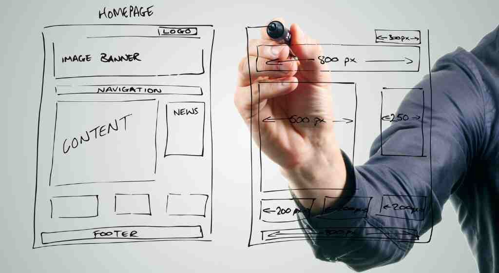
No matter which page they are on, visitors can easily find the information they are searching for by using a familiar layout that you provide by maintaining a consistent structure. This uniformity contributes to a fluid surfing experience and improves your website’s overall usability.
The template’s sections should each have a specific purpose and be aesthetically different in order to prevent misunderstanding. The website’s logo, primary menu, and sometimes other components like a search bar or social networking icons are all commonly found in the header area, for instance. The unique material for each page, such as articles, blog entries, or product information, may be found in the main content area.
The arrangement of the parts inside each segment also follows a consistent framework. The navigation menu, for instance, needs to be at the same location on every page if it is placed on one page at the top of the header. Similarly, if you add a sidebar to the main content area, make sure that it is always in the same place on every page.
Responsive Design of website templates
A crucial component of contemporary web development, particularly when developing templates, is responsive design. In order to give consumers the best viewing experience, entails developing and creating templates that can adjust and react to various screen sizes and devices.
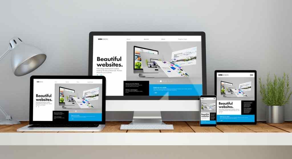
Make sure your website themes are responsive because more people are using smartphones, tablets, and numerous other devices to access the internet. By using responsive design strategies, you can make sure that your templates automatically reflow and modify their content to meet the screen size and orientation of the device being used.
When used on a variety of devices, a responsive template will automatically adjust its layout, graphics, and typography to offer a unified and user-friendly experience. It makes it possible for people to view and utilise your website without having to zoom in or out or scroll horizontally.
To accomplish its objectives, responsive design uses CSS media queries, adaptable grids, and fluid images. With the use of media queries, you may specify various CSS rules based on unique device attributes like screen width or resolution. While fluid pictures resize to fit inside their containers, flexible grids ensure that the template’s layout adjusts appropriately to different screen widths.
Intuitive Navigation in Website Templates
An essential component of website layouts that significantly affect the user experience is intuitive navigation. It refers to creating a navigation system that is simple to use and comprehend so that users can quickly access the information they require.
Here is a closer examination of the fundamental components of simple navigation in website templates:
Clear Menu Structure
The menu, which is commonly positioned in the template’s header section, should have a simple, logical layout. For menu items, be sure to include clear and detailed labels that appropriately describe the associated page or area.
Consistent Placement
Ensure that the navigation menu is positioned consistently on each page of the template. Users rely on consistent positioning to find the navigation and easily access various website sections.
Highlight Current Page
It is useful to visually show which menu item relates to the current page when a user navigates to a certain page. This “active” or highlighted condition gives consumers a feeling of direction and enables them to locate themselves on the page.
Breadcrumb Navigation
The breadcrumb navigation feature shows the current page’s hierarchical route and provides an alternative navigation option. It gives consumers a clear idea of where they are in relation to other sites and makes it simple for them to return to those pages.
Search Functionality
Implementing a search function in the template enables users to locate particular material or information quickly. Put the search box in a visible spot for easy access, like the header.
Mobile-Friendly Navigation
With the popularity of mobile browsing, navigation must be made to be mobile-friendly. Use a collapsible menu, sometimes known as a “hamburger menu,” to save space on smaller displays while maintaining access to the navigation choices.
Logical Link Placement
Make sure that the links inside your template’s content are relevant and arranged appropriately. Users anticipate that links will take them to relevant material or offer more details on a subject.
User-Friendly Labels
For navigational objects, use concise and evocative labels rather than unclear or vague terminology. Be sure to use labels that appropriately describe the functionality or content of the linked page.
Consistent Navigation Design
Keep your navigation components’ visual designs the same across the whole template. The use of consistent colours, font, and hover effects improves user familiarity and usability.
User Testing and Iteration
To assess the efficiency and usability of your navigation, conduct user testing. To enhance the user experience, collect feedback, pinpoint problem areas, and iterate on your navigation design.
Intuitive Navigation in Website Templates
As we know, typography and readability play a significant role in creating effective and visually appealing website templates. They impact how users perceive and interact with the content on your website.
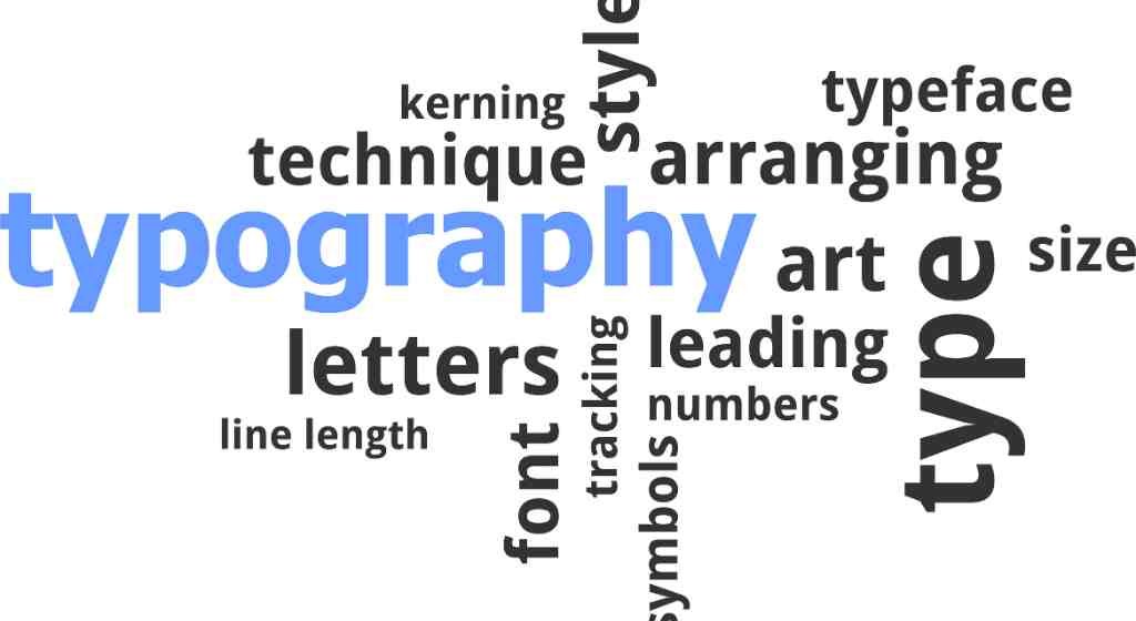
Here’s an overview of key considerations for typography and readability in website templates:
Font Selection, Font Size, Line Spacing, Paragraph Length, Contrast, Hierarchy and Formatting, Alignment, Readability Across Devices, Responsive Typography, Accessibility etc are a few important factors.
You may make your website designs more aesthetically beautiful and user-friendly by considering typography and readability. Your material will be more readable and appealing to a wider range of people if you employ the right fonts, sizes, and spacing. Emphasizing typography and readability eventually improves user interaction with your website’s content.
Color Scheme and Visual Hierarchy
Essential components of website templates that significantly affect a website’s overall appearance and feel are the colour scheme and visual hierarchy. They are crucial in grabbing consumers’ attention, keeping them focused, and producing a visually appealing and integrated design.

You may make a visually appealing and user-friendly website template by carefully choosing a colour palette that complements your brand and includes a well-defined visual hierarchy. A memorable and engaging experience may be made by using the proper colours and visual signals to lead people through your information, highlight important points, and more.
Whitespace and Visual Balance
The empty or vacant spaces in a design are referred to as whitespace, often known as negative space. It is essential for producing a visually appealing and well-balanced website template.
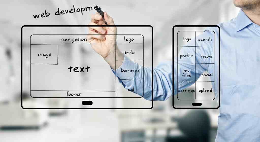
Your website layouts will be more aesthetically beautiful and user-friendly if you carefully employ whitespace and achieve visual balance. Effective use of whitespace results in a more appealing and pleasurable browsing experience by enhancing the overall visual appeal, enhancing readability, and drawing users’ attention to the key parts.
Optimized Image Usage
When designing website designs, optimising image use is essential to ensure quick load times, a better user experience, and effective server resource management.
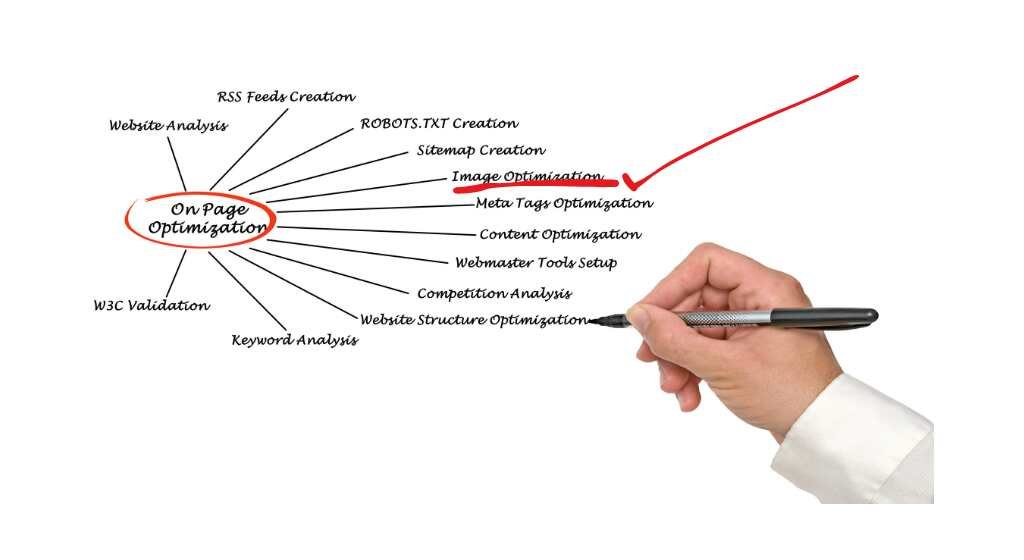
You may drastically increase website performance, lower bandwidth use, and improve user experience by employing optimised image usage approaches. Images that have been optimised provide for quicker page loads, more fluid surfing, and a more effective and satisfying user experience for your website.
Browser Compatibility in Website Templates
When developing website templates, it is crucial to consider browser compatibility in order to give consumers a consistent and useful experience across various web browsers.
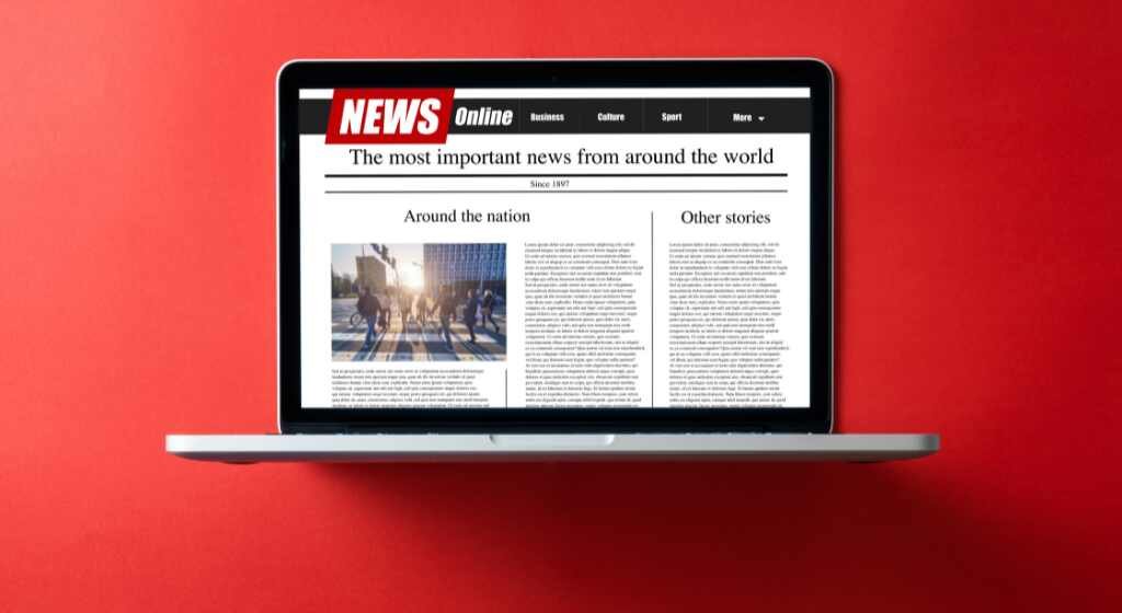
In order to give consumers a consistent experience regardless of the web browser they use, you should take into account browser compatibility while creating the website layouts. Prioritising compatibility improves user experience, minimises possible problems, and aids in the efficient operation of your website across a variety of browser contexts.
Modularity and Reusability in Website Templates
When designing website templates, modularity and reusability are crucial considerations since they encourage effective development, simple maintenance, and scalability.

By placing a strong emphasis on modularity and reusability in your website templates, you may speed up the development process, make maintenance and updates easier, and provide users with the freedom to modify and expand the template to suit their own requirements. Adopting these principles improves the development process overall, supports scalability, and encourages code efficiency.
Conclusion
By considering these points, you can create well-structured and visually appealing templates for your website front that provide a great user experience across different devices and browsers.
Share this :


