Why Does Your Website Look So Cheap? 5 Design Mistakes to Avoid
Recent Blog
Ready to Transform Your Business? Contact Us Today
Why Does Your Website Look So Cheap? 5 Design Mistakes to Avoid
- Rohit Singh
- October 27, 2024
- 0 Comment
Table of Contents
Introduction: 5 Design Mistakes to Avoid
Ever wonder why your website looks unprofessional or “cheap” compared to your competitors? The answer often lies in a few key design mistakes that are all too common. When visitors land on your website, the design is the first thing they notice, and it’s what shapes their overall impression of your brand. If your site looks outdated or poorly designed, users will assume the same about your products or services. In this article, we’ll explore five design mistakes that could be making your website look less than impressive and how to fix them.
Mistake 1: Overwhelming Clutter and Lack of White Space
The Impact of Too Much Content
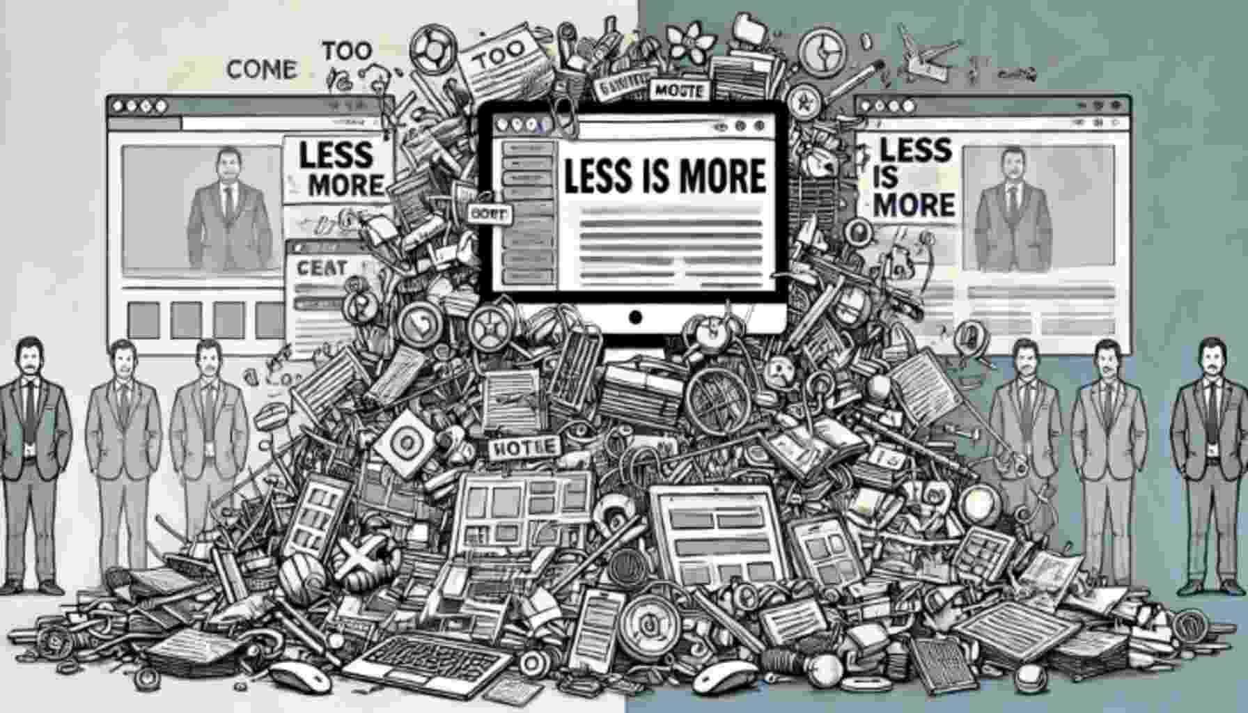
Many businesses make the mistake of cramming as much information as possible onto their web pages. While displaying everything at once might seem like a good idea, an overwhelming amount of content can be off-putting. Too much text, images, or buttons can confuse your visitors, making it hard for them to find the information they need.
The Importance of White Space for Aesthetic Appeal
White space, also known as negative space, refers to the empty areas on your page. It doesn’t have to be literally white; it’s simply the absence of content. White space allows the eye to rest, giving your website a clean, organized look. Without it, your site can appear cramped and chaotic.
How to Fix It: Less is More
Start by auditing your current content. Remove any unnecessary text or images. Prioritize the most important elements and use white space to draw attention to them. A minimalist approach not only makes your site look more professional but also enhances usability.
Mistake 2: Poor Quality Images and Graphics
Blurry or Low-Resolution Images
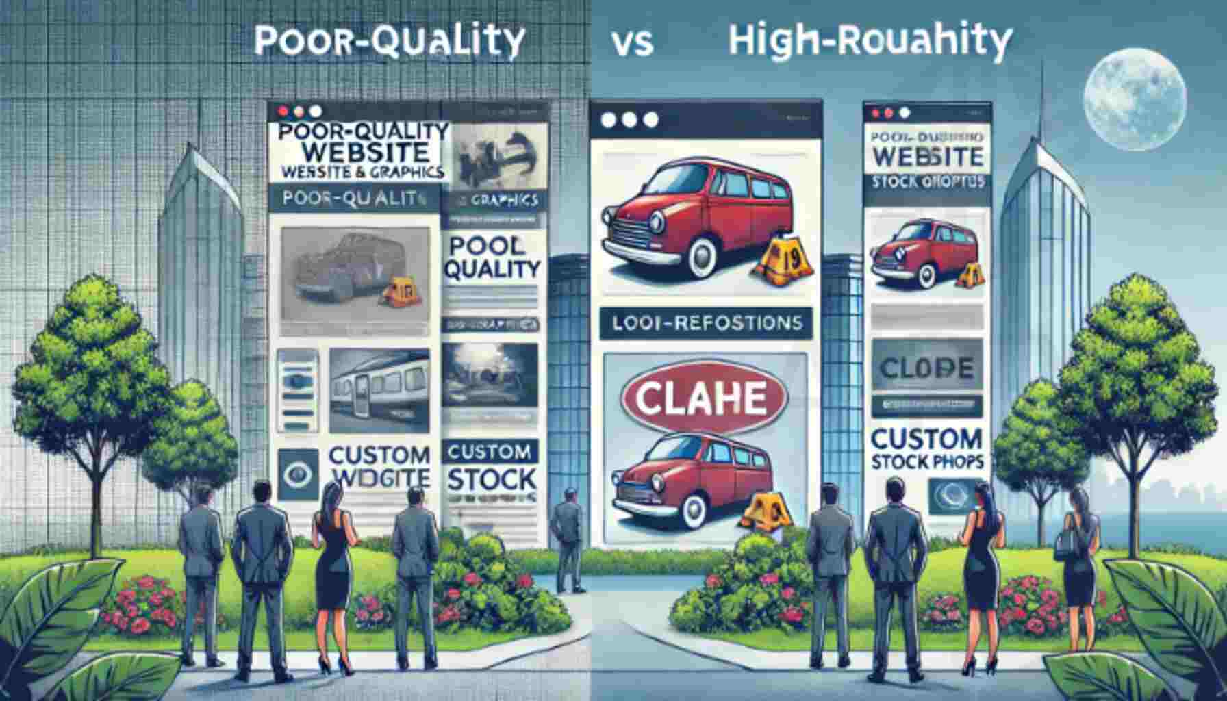
Nothing screams “cheap” like pixelated or blurry images. Poor-quality visuals can ruin the overall aesthetic of your website and reduce trust in your brand. Visitors may think that if you can’t present high-quality visuals, your products or services might lack quality too.
Stock Photos Overload
While stock photos can be a convenient solution, overusing them—or using cliché, generic ones—can make your website look impersonal. Stock photos are often easily recognizable, which can make your site feel disconnected from your brand.
How to Fix It: Invest in High-Quality Visuals
Investing in professional photography or high-quality, custom graphics can instantly elevate the look of your website. If custom photos aren’t in your budget, there are plenty of websites offering high-resolution, royalty-free images. Just be sure to choose visuals that align with your brand.
Mistake 3: Non-Responsive Design
Mobile Experience Matters
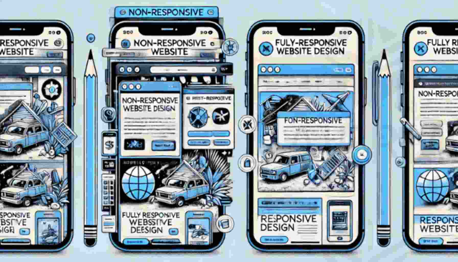
More and more users are accessing websites on their mobile devices. If your website isn’t optimized for mobile, you’re likely losing visitors. A non-responsive design can lead to awkward layouts, hard-to-read text, and broken elements on smaller screens.
Ignoring Tablet and Other Devices
Responsiveness isn’t just about mobile phones. Users may be browsing on tablets, laptops, or desktops, each with different screen sizes. If your site only looks good on a desktop, you’re missing out on a huge chunk of traffic.
How to Fix It: Embrace Responsive Design
A responsive website automatically adjusts its layout and elements to fit any screen size. Many website builders and themes come with built-in responsiveness. However, it’s crucial to test your site on multiple devices to ensure a seamless experience.
Mistake 4: Inconsistent Branding and Typography
Mismatched Colors and Fonts
Inconsistent branding is another major culprit in making a website look cheap. If your site uses too many different fonts or colors, it can create a jarring experience for users. Consistency is key to establishing brand identity and ensuring your website looks polished.
Branding Confusion
Your website should reflect your brand’s identity clearly. If your logo, colors, and typography are inconsistent across different pages, visitors may struggle to understand what your brand stands for.
How to Fix It: Keep Your Branding Cohesive
Stick to a limited color palette and no more than two or three fonts across your website. Make sure these design choices align with your overall brand identity, whether it’s playful and colorful or sleek and professional.
Mistake 5: Slow Loading Speed
The Impact on User Experience
If your website takes too long to load, visitors will abandon it within seconds. Slow load times can give the impression that your site is poorly maintained, which reflects poorly on your business.
Not only does a slow website frustrate users, but it also hurts your search engine rankings. Google prioritizes fast-loading websites in its search results, so if your site is sluggish, you’re losing both visitors and visibility.
How to Fix It: Optimize for Speed
There are many ways to improve your website’s speed. Start by compressing large image files, enabling browser caching, and minimizing code. Tools like Google PageSpeed Insights can help identify areas for improvement.
The Role of User Experience (UX) in Website Design
How Good UX Can Improve Website Credibility
User experience (UX) is all about making your website easy and enjoyable to navigate. A well-designed UX not only keeps visitors on your site longer but also builds trust in your brand. When users can find what they need quickly, they’re more likely to engage with your content and return in the future.

Key Elements of UX to Focus On
Focus on clear navigation, intuitive design, and fast loading times. Make sure your call-to-action buttons stand out, and that users can easily move through your website without encountering roadblocks.
The Value of Professional Web Design Services
Why DIY Web Design Might Be Hurting Your Business
DIY website builders might seem like a cost-effective solution, but they often result in cookie-cutter websites that don’t stand out. A professionally designed website, on the other hand, can be tailored to your brand’s unique needs and create a memorable user experience.
Investing in a Professional Website Designer
While it may cost more upfront, investing in a professional web designer will pay off in the long run. A well-designed website will attract more visitors, convert more leads, and ultimately drive more sales for your business.
Conclusion: Take An Appropriate Action
Your website is often the first impression potential customers will have of your brand. Avoiding these common design mistakes—such as clutter, poor-quality visuals, non-responsiveness, inconsistent branding, and slow load times—can make all the difference.
By investing in quality design and focusing on user experience, you can ensure that your website not only looks professional but also functions seamlessly, keeping visitors engaged and boosting your business’s credibility.


6 thoughts on “Why Does Your Website Look So Cheap? 5 Design Mistakes to Avoid”
Appreciation you.
Thanks
I’ve had similar thoughts, glad you mentioned it.
Anyone else seen it?.
Hope fully, Thanks
Completely agree with this, glad you mentioned it.
Thank you